Any company logo needs to be carefully designed or chosen, as it’s usually part of the first impression stakeholders get. If a logo is weak, it won’t properly represent the company and might even end up being offensive.
Having a clever logo could be an excellent marketing strategy for any business. It’s hence worth looking at these 50 examples of outstanding logos for inspiration. The logos below have quite a bit of clever designing in each. Some have subliminal messages, while others might make the most use of a limited space.
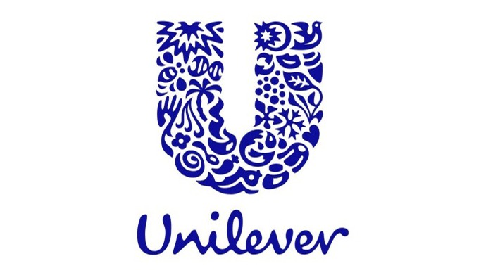
Unilever
There are several small details in the large “U” here, each representing something different. The bird represents freedom, while the heart signifies love and care.
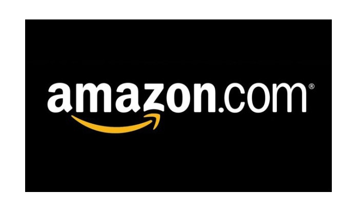
Amazon
The innovative logo here is simple but holds at least two meanings. The arrow goes from A to Z, meaning that the company sells just about everything. The same arrow is also a smile with a dimple.
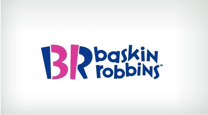
Baskin Robbins
The bright colors are reminiscent of ice cream, but they also form the number ‘31’, which is the number of flavors this chain offers.
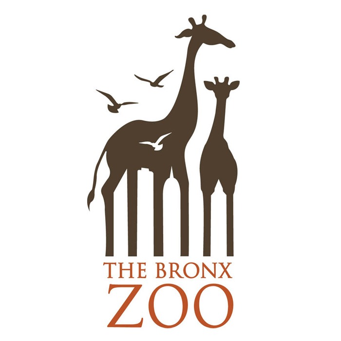
Bronx Zoo
The animals here present a simple, pleasing effect, but the negative space also denotes the Bronx skyline.
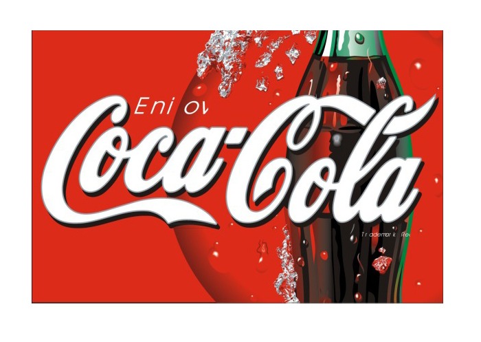
Coca-Cola
Someone found that the Denmark flag was unintentionally hidden in the “o”s of the Coca-Cola logo. The company decided to make the most of it by putting actual Denmark flags on a Coca-Cola sign in the country’s largest airport. These were meant to welcome everyone into the country, as per the tradition there.
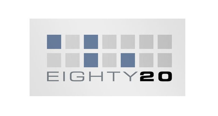
Eighty Twenty
This logo uses gray plus blue blocks in binary code for spelling out its name. The top represents the number ‘80’ with 1010000, and the bottom represents ‘20’ with 0010100.
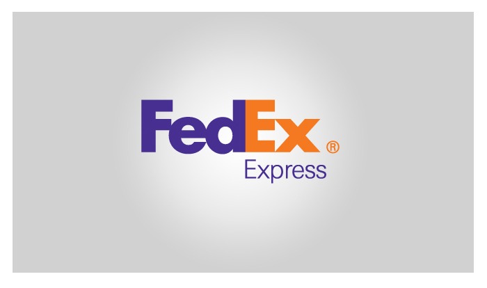
FedEx
The last two letters of this logo make use of the negative white space to create an arrow pointing forward. This symbolizes the speed of delivery by the courier service.
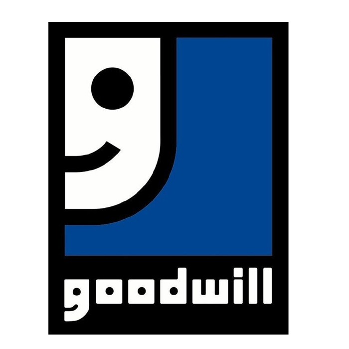
Goodwill’s Smile
Goodwill’s main logo is a smiley face. Part of the same face is used to make the initial letter “g” in the name itself.
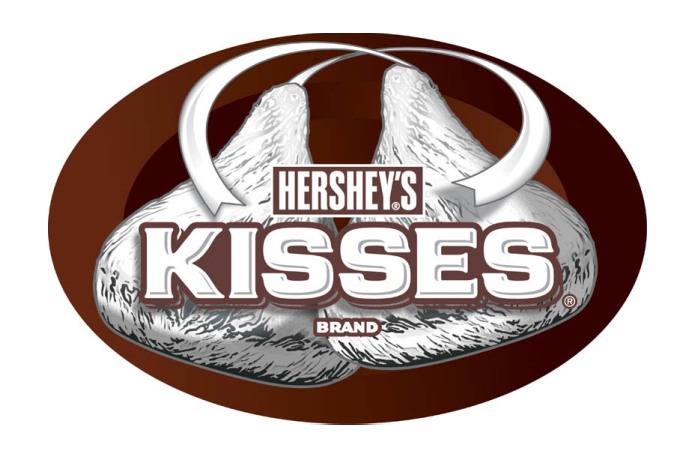
Hershey’s Kisses
One can see the shape of a Hershey’s Kiss between the two letters “K” and “I”.
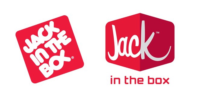
Jack In The Box
The logo for this fast-food chain has changed now, but the old one made a Jesus fish (or a Greek ichthys) from the letters “O” and “X”. Whether this had any religious connotation or was simply a coincidence is unclear.
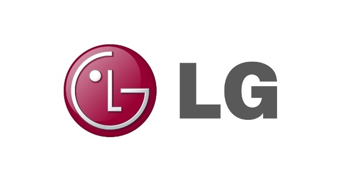
LG Electronics
LG wanted everyone to feel good about their brand… they incorporated a subtle “Pac-Man” character as well as a winking face.
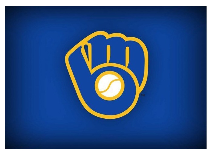
Milwaukee Brewers
There’s a baseball glove apparent here but it also forms the “M” and “B” initials of this sports team.
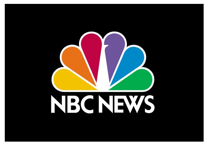
NBC
The peacock logo is famous for its colors, but they also represent the channel’s diversity and global reach.
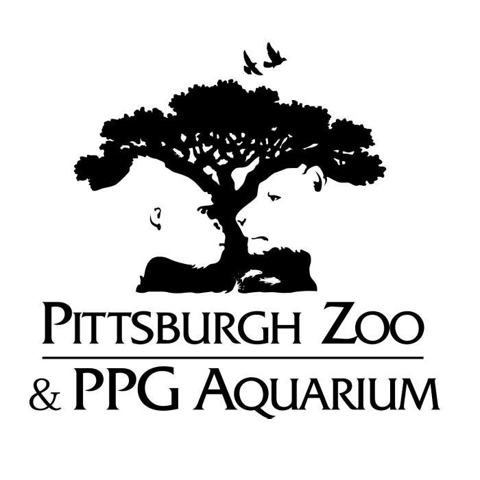
Pittsburgh Zoo
This logo features several shapes: a monkey, lion, trees, and birds. It’s a lovely use of negative space, both black and white.
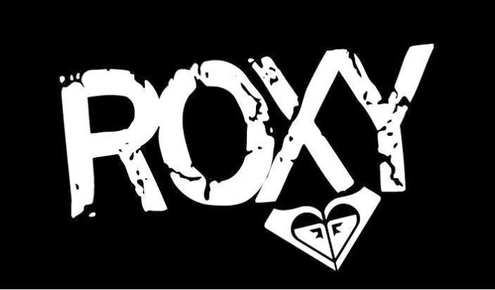
Roxy
Roxy is a brand of apparel targeting young women and a subsidiary of the more famous Quicksilver. It adds a feminine touch and uses familiarity by using two Quicksilver logos joined together to form a heart.
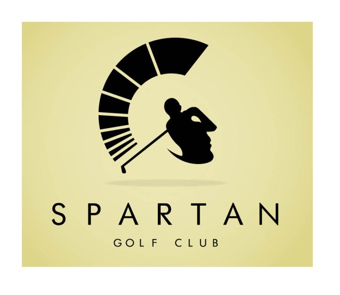
Spartan Golf Clubs
The shape of a golfer here is encircled by rectangular shapes on one side, making it seem like a Spartan warrior as well.
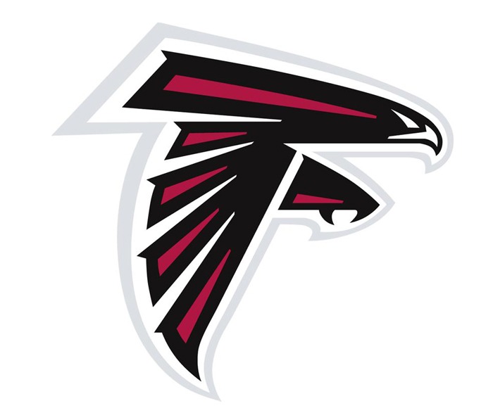
The Atlanta Falcons
There’s a falcon as well as the letter ‘F’ embedded inside the logo.
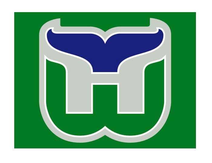
The Hartford Whalers
This team is not around anymore, but the “W” and whale tail are still clever ideas.
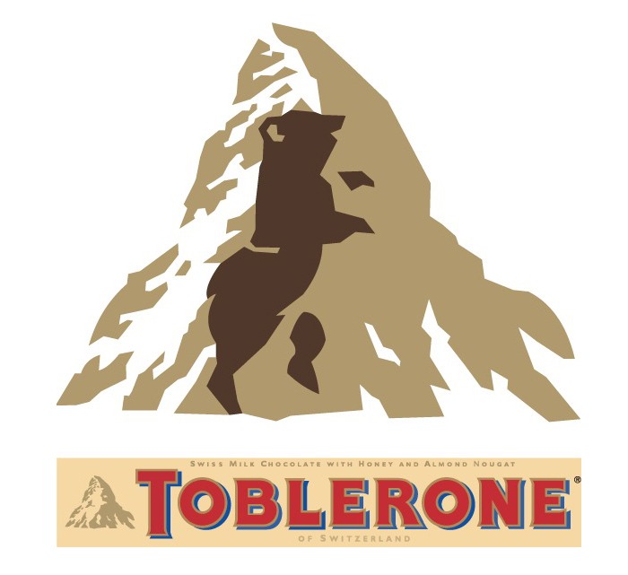
Toblerone
Toblerone’s logo is at first glance just a mountain, which probably denotes the Swiss Alps. The chocolate comes from around that area, but the hidden addition of a dancing bear in the mountain makes this more interesting.
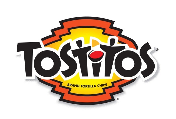
Tostitos
This is a brand of dipping sauces and salsas. It’s hence fun to notice that the two “T”s in the middle are actually two people with chips in their hand and salsa between them.
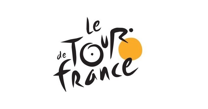
Tour De France
This logo features the abstract shapes of a cyclist riding an orange circle, presumably the sun. It’s not just clever, but also practical in letting people know the event is during the day.
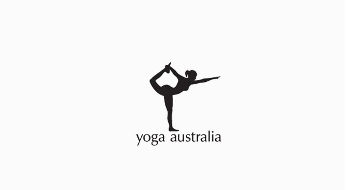
Yoga Australia
This yoga pose forms the shape of Australia itself between the arms and leg.
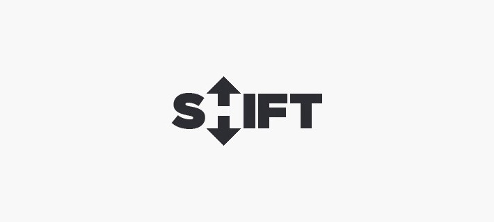
Shift
The “H” and the two arrows create a negative space here, giving the impression of shifting gears.
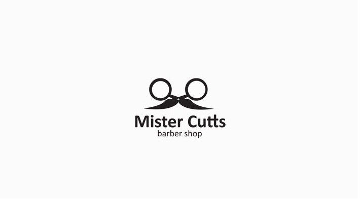
Mister Cutts
The scissors in this logo have a unique shape, also giving the impression of round spectacles and a mustache.
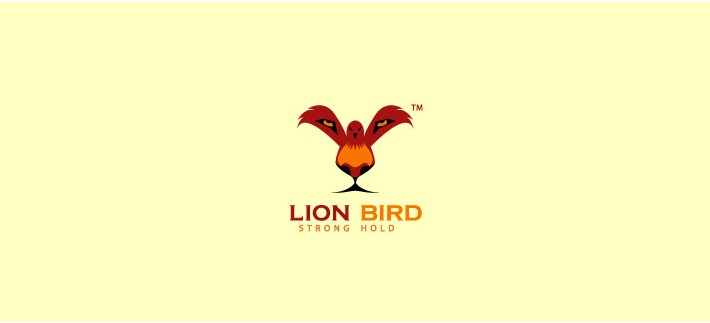
Lion Bird Strong Hold
This logo may not give much hint of what the company does, but it does present a clever double image. The bird’s wings give the impression of a lion’s eyes, with the rest of the features also being apparent.
Very creative use of two images in one – the bird with its wings and the lions face with the eyes nose and mouth.
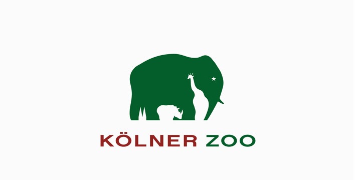
Kolner Zoo
An elephant silhouette is a common logo for a zoo, but the negative space also creates the shape of a rhino and a giraffe.
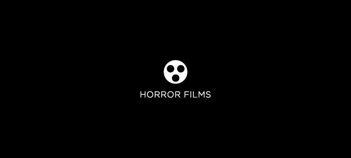
Horror Films
The simplistic, minimal logo here uses an iconic film reel appearance to give the impression of a masked face. The later could possibly be interpreted as having a scared expression.
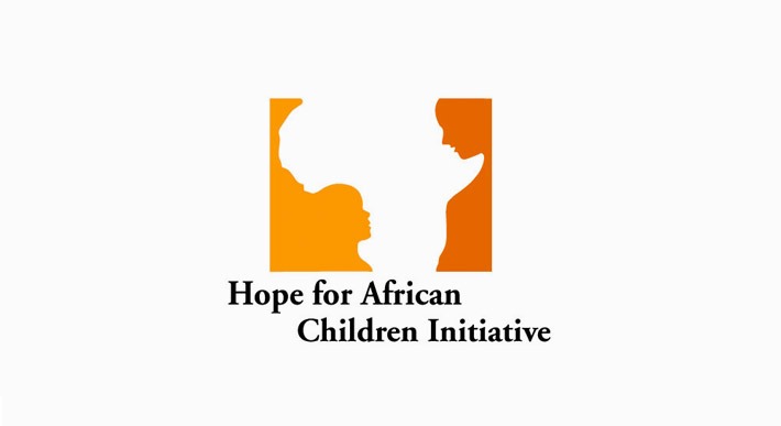
Hope for African Children Initiative
The logo here shows two children looking at each other, but the space between them embodies the African continent as well.
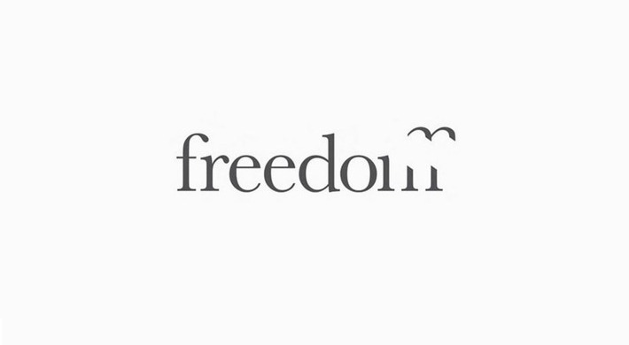
Freedom
Another simple logo here makes use of its ’m’ to show a bird flying away. This symbolizes the very meaning of the word itself.
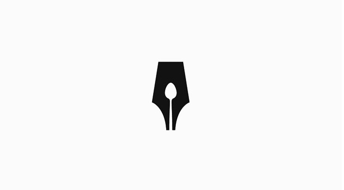
Guild of Food Writers
The pen nib here has a spoon inside it, hence portraying the guild’s connection with both food and writing.
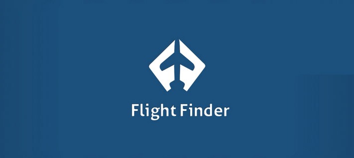
Flight Finder
The two initials of the company name are angled to form a plane in the middle. The viewer hence immediately knows that this has something to do with flying.
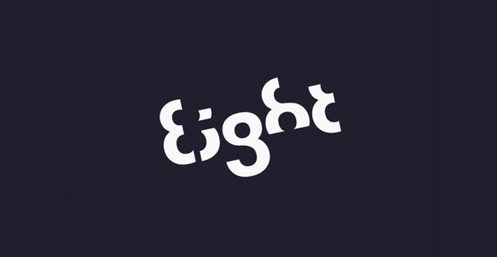
Eight
The name of the company is Eight, and its logo is just the name made up of partial numerical eights.
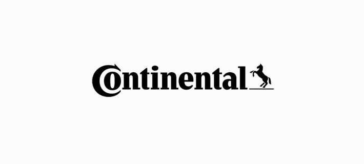
Continental
The first letter here is “C”, which is stylized into a type. This lets the viewer know immediately that it’s a company related to the car industry in some way.
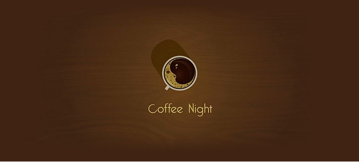
Coffee Night
The coffee’s froth here denotes a crescent moon, hence symbolizing the name of the company.
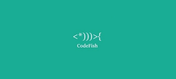
CodeFish
The logo here comprises of the coding symbols <*)))>{, which makes a fish.
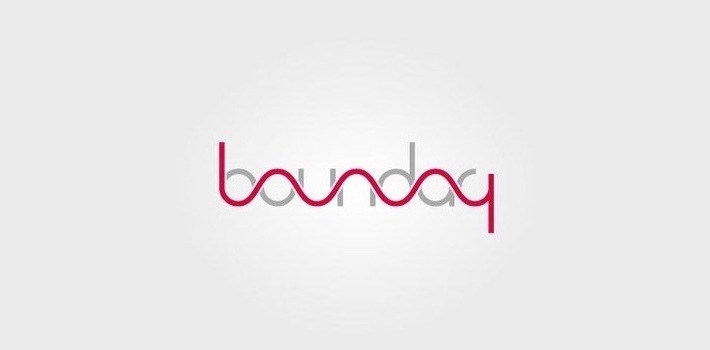
Boundary
Two design elements and two colors come together here to form a unique shaping of the name.
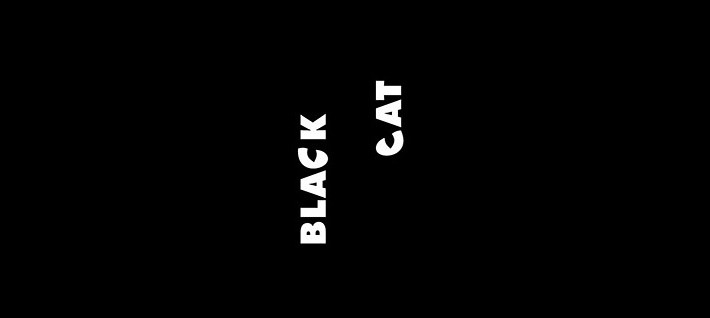
Black Cat
Both “C”s in the company name are stylized as eyes. These create a delightful impression when the user first notices it.
Bearhanded
The bear’s legs also form four fingers of a human hand. Again, the name of the company is spelled out in the image.
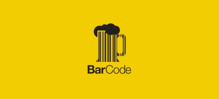
Barcode
This logo displays a frothy mug of beer, with the mug made up of a bar code. It’s hence also a play on the word ‘bar’.
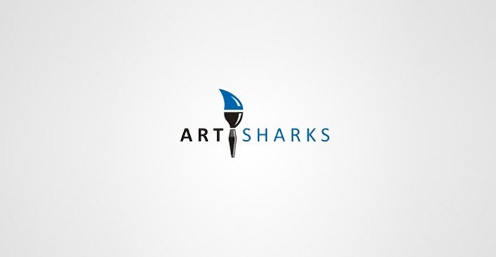
Art Sharks
Here, the tip of a paintbrush becomes a shark fin, hence symbolizing the name of the organization.
London Symphony Orchestra
This logo combines the initials of the name with an abstract shape of a conductor holding a baton.
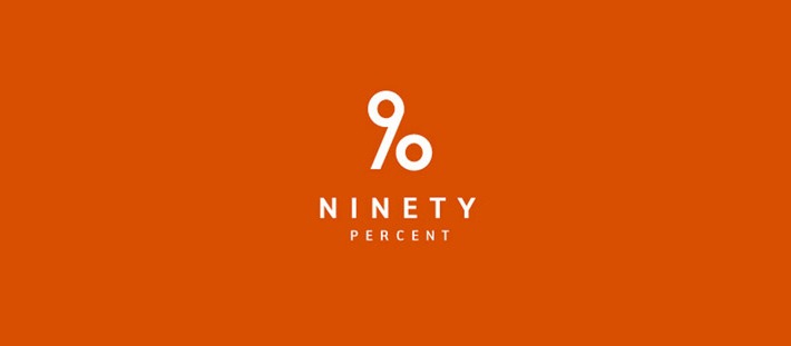
90 Percent
The cleverness here lies in the number ‘90’ and the ‘%’ sign, which one can see in the same place.
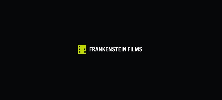
Frankenstein Films
The company name and nature is clear here, with a piece of film reel that’s colored green. Some of the holes are missing in order to create a boxy profile of Frankenstein’s monster.
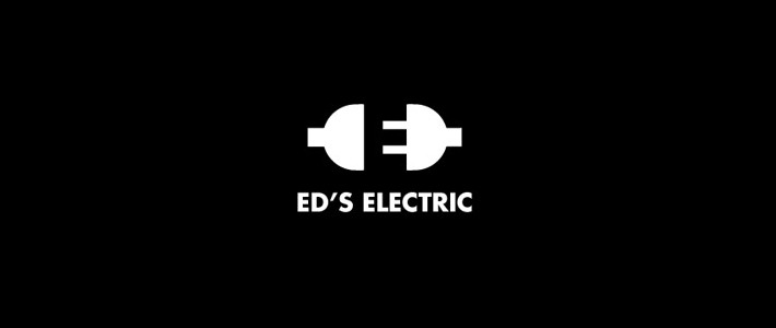
Ed’s Electric
This simple logo is quite brilliant with its use of black and white space. At first glance, it seems to be a while plug going into a socket. When one looks closely, there’s a black “E” between the two.
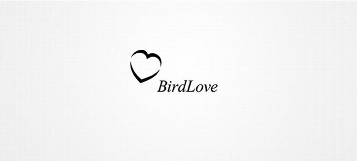
Bird Love
This logo gives an image of the two words making up the company name. It’s also simplistic, with two bird shapes forming a heart.
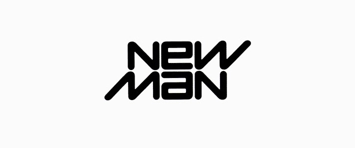
Newman
This logo uses the name of a company as an anagram. It’s also reversible, so one can turn it upside-down and read it in the same way.
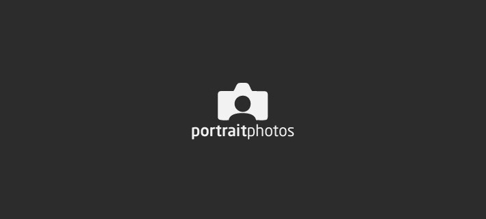
Portrait Photos
The name and nature of this company are both apparent with a person’s image inside the shape of a camera.
Conclusion:
The above logos are quite clever, but they’re not just for fun. They actively serve a powerful marketing purpose in making the consumer feel excited and interested. If the cleverness is hidden and a potential customer finds it, they’d feel a connection to the company and hence be more likely to stay loyal toward it.